Reduce Cloudinary Transformations With Eleventy Image

Relying on cloud based services like Cloudinary for image optimization comes with a price.
Honeymoon Phase
In my search for ways to optimize images, I came across a Software-as-a-Service (SaaS) solution known as Cloudinary. Its primary aim is to handle the management of all media assets for web or mobile applications in the cloud. Cloudinary achieves this by delivering content from high-performance servers through Content Delivery Networks (CDNs). The free plan offered by Cloudinary is quite generous, allowing users to upload images with a maximum file size of 10 MB and maximum megapixels of 25 MP. Additionally, it provides features such as image and video transformations, along with the option to utilize their Content Delivery Networks for efficient and high-performance content delivery. The free plan permits 3 users per account and grants 25 monthly credits. One credit can be used for
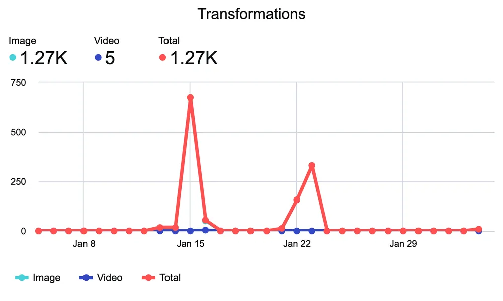
- 1000 transformations - Most image transformations, including complex chained transformations count as a single transformation.
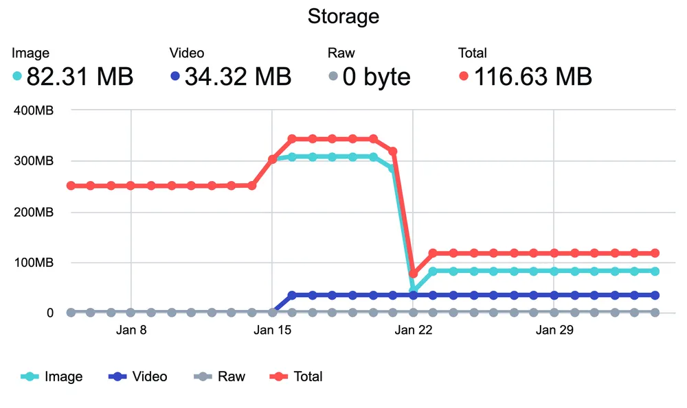
- 1 GB of managed storage - Storage includes your main asset storage, a cached copy of each derived asset (from delivered transformations), and any revisions backed up to the Cloudinary backup storage.
- 1 GB of delivered bandwidth - For images, the bandwidth is based on the delivered image file size.
Realization
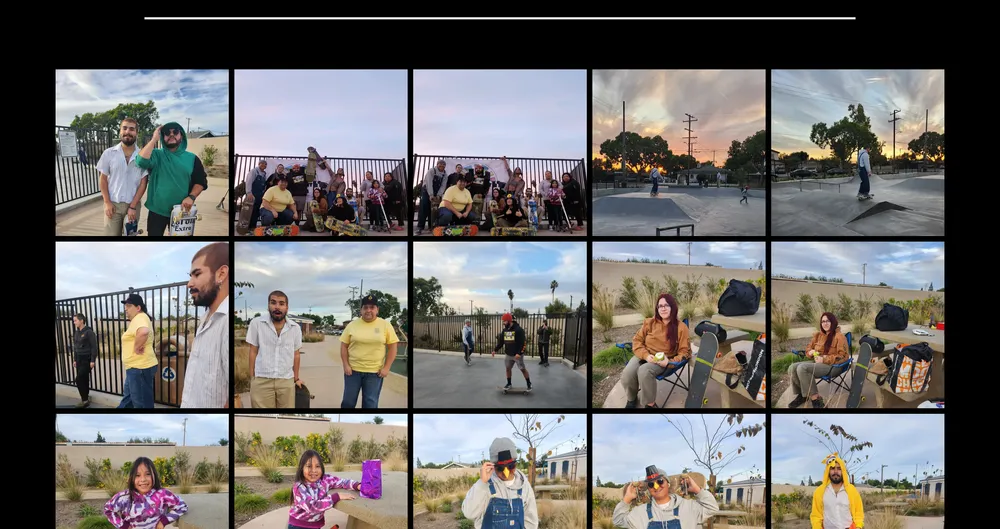
Upon reviewing the details regarding credit usage and the number of transformations allowed per credit, I initially wasn’t concerned about exceeding my limit. However, my perspective shifted when I took on a client project. The task involved developing a website for Sk8 N Meet Santana along with a content management system (CMS). This skateboarding group organizes monthly gatherings for skaters of all skill levels in the Southern California area, striving to create a vibrant and secure space for individuals who identify as female, queer, trans, and/or nonbinary. During each meeting, the group leaders capture photos, storing them in Google Photos for archival purposes and sharing a selection on Instagram. Through our daily discussions about their website requirements, I gained insight into the substantial number of photos accumulated from previous meetups. It became apparent that the Cloudinary limit could be reached sooner than initially anticipated.

Solutions
One early solution I implemented involved resizing the photos before uploading them to Cloudinary, considering that storage contributes to credit usage. Drawing from my experience with the Squoosh website in previous projects, I contemplated manually converting each photo to the webp format. WebP typically offers superior compression compared to JPEG, PNG, and GIF, and it enjoys broad support across modern browsers. However, the tedious work of having to convert each and every photo turned me off from using this approach.
I sought an automated solution and discovered Google’s WebP converter, which allows the use of command-line instructions to convert image files from PNG or JPEG formats to WebP. An example of converting a PNG image file to a WebP image with a quality range of 80 in the command line:
cwebp -q 80 image.png -o image.webp
Various additional options are available for customization, such as altering the height or width of an image, but these did not yield the desired results I was seeking.
Later, I discovered Eleventy-img and was impressed by its simplicity. It allows you to specify the desired image formatting directly in a JavaScript file, eliminating the need for command-line operations. After some configuration, I crafted a JavaScript file capable of processing three image formats, converting them to webp, adjusting their widths, automatically resizing the height, and generating output with new names reflecting the size and format. The flexible naming and support for multiple widths presented opportunities for further image optimization, more on that later.
const imageDir = "./images/";
// all the image formats we're willing to optimize
const imageFormats = [".jpg", ".png", ".jpeg"];

async function optimizeImage(file) {
  const stats = await Image(imageDir + file, {
    widths: [700, 1000], // edit to your heart's content
    formats: ["webp"],
    outputDir: imageDir + imageDir,
    filenameFormat: (id, src, width, format) => {
      // make the filename something we can recognize.
      // in this case, it's just:
      // [original file name] - [image width] . [file format]
      return `${parse(file).name}-${width}w.${format}`;
    },
  });
  console.log(stats); // remove this if you don't want the logs
}

(async () => {
  const files = await readdir(imageDir);
  for (const file of files) {
    const fileExtension = parse(file).ext.toLowerCase();
    if (imageFormats.includes(fileExtension)) {
      await optimizeImage(file);
    }
  }
})();
This was precisely what I needed. The procedure produced the outcomes I desired and reduced my dependence on Cloudinary. I can now mass-edit images and subsequently upload them to Cloudinary in a format that significantly reduces the image size without compromising quality. This enables me to reallocate credits from transformations to storage, offering a more efficient use of resources.


Optimization And Beyond
The optimization did not stop there. I integrated the picture element within a reusable Image component to reduce dependency on NextJS. While NextJS’s built-in Image component streamlines image optimization, it does have its limitations. Considering the substantial number of potential images, I aimed to avoid reaching those limits early.
Planning ahead with Eleventy-img, I incorporated width sizes into the file names, such as {image-name}700w.webp and {image-name}1000w.webp. Leveraging the adaptability of the picture element, I could dynamically select the appropriate image to serve based on the user’s viewing device. As per for the MDN documentation, the picture element wraps the img element along with some attributes.
- the
typeattribute determines what the media type of the image, which in this case will always beimage/webp - the
srcsetattribute takes in a list of source URLs for a given image format followed by a pixel-value width and awon the end - the
sizesattribute is a way to tell the browser which image to use for a given screen size
My custom component ended up looking like this:
interface ImageProps {
  largeImg: string;
  smallImg: string;
  height: string;
  width: string;
  sizes: string;
  loading: "eager" | "lazy" | undefined;
  alt: string;
  className?: string;
}

const Image = ({
  largeImg,
  smallImg,
  sizes,
  height,
  width,
  loading,
  alt,
  className,
}: ImageProps) => (
  <picture>
    <source
      type='image/webp'
      srcSet={`${smallImg} 600w, ${largeImg} 1000w`}
      sizes={sizes}
    />

    <img
      src={smallImg}
      loading={loading}
      height={height}
      width={width}
      alt={alt}
      className={className}
    />
  </picture>
);

export default Image;
The component takes in image props found in the img element such as width and height and props that will determine which image to serve depending on the screen width / viewing device. The srcSet attribute is given a list of image sources with specified widths, in this case 600w and 1000w. The browser will then decide which source to use based on the sizes attribute. An example of used case for a banner image is:
The component receives image-related props from the img element, including width and height, as well as additional props to determine the appropriate image to serve based on the screen width or viewing device. The srcSet attribute is assigned a list of image sources with defined widths, such as 600w and 1000w. The browser, in turn, determines which source to utilize based on the information provided by the sizes attribute. An example of use case for a banner image is:
sizes = "(max-width: 768px) 100vw, (max-width: 1200px) 50vw, 33vw";This implies that on smaller screen widths, up to 768px or tablet size, the image should occupy the full width. For screen widths larger than 768px and up to 1200px, the image should occupy half of the width. The last size serves as a fallback, where the image would occupy a third of the screen.
In my search to reduce reliance on Cloudinary, I found Eleventy-img. The package not only changes the image format but handles transformations. The integration of the Picture element with the transformed image efficiently conserves bandwidth and accelerates page load times by delivering the most suitable image for the viewer’s display. This process has saved me monthly credits on not only on Cloudinary but NextJS as well. Each new monthly meetup from Sk8 N Meet Santana can quickly be automated and uploaded into the CMS effortlessly.
While seeking to diminish dependence on Cloudinary, I discovered Eleventy-img. This package not only alters the image format but also manages transformations. By integrating the Picture element with the transformed image, it effectively preserves bandwidth and speeds up page loading times by delivering the most appropriate image for the viewer’s display. This streamlined process has resulted in savings not only in monthly credits on Cloudinary but also on NextJS. The automation of each new monthly meetup for Sk8 N Meet Santana can now be effortlessly handled and uploaded into the CMS.